Brand Identity Design Services: 10 Ways Typography Shapes Modern Brand Identity
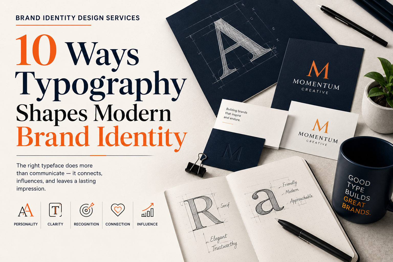
Brand Identity Design Services: 10 Ways Typography Shapes Modern Brand Identity
Introduction
When people think about branding, they often focus on logos, colours, or graphics. While these elements are essential, there’s another design component that quietly shapes how customers perceive a business—typography.
Typography is much more than choosing an attractive font. It influences readability, personality, credibility, and consistency across every customer touchpoint. From your website and social media posts to packaging, advertisements, and business cards, typography helps communicate who you are before customers even begin reading your message.
Think about some of the world’s most recognised brands. Even without seeing their logos, many people can identify them by the style of their lettering. That’s because typography becomes an integral part of a brand’s visual identity over time.
The right typeface can make a business appear modern, trustworthy, luxurious, creative, or approachable. The wrong one can create confusion, reduce professionalism, and weaken customer confidence.
This is why professional Brand Identity Design Services treat typography as a strategic branding tool rather than a decorative choice. Designers carefully select fonts that align with a company’s personality, target audience, and long-term goals while ensuring readability across both digital and print platforms.
In this guide, we’ll explore 10 ways typography shapes modern brand identity, why it matters for businesses of every size, and how choosing the right typography can strengthen recognition, improve user experience, and build lasting customer trust.
Table of Contents
- Why Typography Matters in Branding
- Way #1: Typography Creates a Strong First Impression
- Way #2: Typography Reflects Brand Personality
- Way #3: Typography Improves Readability and User Experience
- Way #4: Typography Builds Brand Recognition
- Way #5: Typography Creates Emotional Connections
- Way #6: Typography Strengthens Brand Consistency
- Way #7: Typography Supports Brand Positioning
- Way #8: Typography Guides Customer Attention
- Way #9: Typography Improves Digital Accessibility
- Way #10: Typography Evolves with Modern Branding
- Common Typography Mistakes Businesses Should Avoid
- How to Choose the Right Typeface for Your Brand
- Frequently Asked Questions
- Conclusion
Why Typography Matters in Branding
Typography is the visual presentation of language.
Every letter, word, and sentence contributes to how customers experience your brand. While the message itself is important, the way it is presented often determines whether people continue reading.
Imagine visiting two company websites.
The first uses organised headings, readable fonts, balanced spacing, and a clear visual hierarchy.
The second relies on inconsistent font styles, tiny text, crowded paragraphs, and decorative fonts that are difficult to read.
Even if both businesses offer the same service, most people will trust the first company more.
Good typography improves communication.
Great typography strengthens branding.
Professional Brand Identity Design Services understand that typography affects both appearance and functionality. It helps businesses communicate clearly while reinforcing their unique identity across every marketing channel.
Way #1: Typography Creates a Strong First Impression
Customers form opinions within seconds of discovering a business.
Before they evaluate your products or services, they notice your visual identity.
Typography plays a significant role in shaping that first impression.
For example:
- Clean, modern fonts often communicate professionalism.
- Elegant serif fonts can suggest heritage and sophistication.
- Rounded fonts may feel friendly and approachable.
- Bold geometric typefaces often communicate innovation and confidence.
These impressions happen almost instantly.
Although customers may not consciously analyse typography, it influences how they perceive your credibility.
Imagine a financial consultancy using playful handwritten fonts throughout its website.
Even if the information is accurate, the typography could reduce confidence because it doesn’t match customer expectations.
Similarly, a children’s toy brand using rigid corporate fonts may appear less welcoming than intended.
Professional Brand Identity Design Services select typography that supports the brand’s personality while creating a positive first impression from the very beginning.
Way #2: Typography Reflects Brand Personality
Every brand has a distinct personality.
Some businesses want to appear:
- Professional
- Innovative
- Friendly
- Creative
- Luxurious
- Minimalist
- Reliable
Typography helps communicate these characteristics visually.
Let’s look at several examples.
Serif Fonts
Serif typefaces include small decorative strokes at the ends of letters.
They often communicate:
- Tradition
- Trust
- Heritage
- Authority
- Sophistication
Law firms, universities, publishers, and luxury brands frequently use serif fonts because they create a sense of credibility and timelessness.
Sans-Serif Fonts
Sans-serif fonts remove decorative strokes, creating a cleaner appearance.
They commonly represent:
- Simplicity
- Modernity
- Innovation
- Efficiency
Technology companies, startups, software businesses, and digital agencies often choose sans-serif fonts because they work exceptionally well across digital platforms.
Script Fonts
Script fonts resemble handwriting or calligraphy.
They often suggest:
- Creativity
- Elegance
- Personalisation
- Warmth
Because script fonts can become difficult to read in large blocks of text, they’re usually best suited for logos, signatures, or headings rather than body copy.
Display Fonts
Display fonts are designed to attract attention.
They’re ideal for:
- Headlines
- Campaigns
- Event promotions
- Creative branding
However, excessive use can overwhelm readers.
Professional Brand Identity Design Services understand when expressive typography enhances communication and when simplicity delivers better results.
Way #3: Typography Improves Readability and User Experience
Attractive typography is meaningless if customers struggle to read your content.
One of typography’s most important responsibilities is improving readability.
Well-designed typography helps readers move naturally through a page.
This includes:
- Comfortable font sizes
- Appropriate spacing
- Clear line heights
- Logical hierarchy
- Balanced paragraph widths
These elements reduce visual fatigue and make information easier to understand.
Consider a website where every heading uses the same size and weight as the body text.
Visitors would struggle to identify sections or locate important information.
Now imagine a website with:
- Large, clear headings
- Consistent subheadings
- Readable body text
- Well-spaced paragraphs
- Highlighted calls to action
The experience immediately feels more organised.
Professional Brand Identity Design Services focus on typography that supports usability as well as aesthetics.
Good typography doesn’t compete with your message.
It makes your message easier to absorb.
Typography Across Every Brand Touchpoint
Typography isn’t limited to your logo.
Customers encounter your fonts in many different places, including:
- Websites
- Mobile applications
- Social media graphics
- Business cards
- Packaging
- Product labels
- Email newsletters
- Brochures
- Advertisements
- Presentation decks
- Signage
- Digital documents
Consistent typography across these touchpoints creates a seamless brand experience.
When customers repeatedly see the same typography, they begin associating it with your business.
Over time, this familiarity strengthens recognition and trust.
This is why professional Brand Identity Design Services create detailed typography guidelines that define:
- Primary fonts
- Secondary fonts
- Heading styles
- Body text styles
- Font sizes
- Font weights
- Line spacing
- Digital and print usage rules
These standards ensure every piece of communication looks like it belongs to the same brand.
Key Takeaways
Typography influences far more than appearance.
It shapes first impressions.
It communicates personality.
It improves readability and user experience.
Businesses that treat typography strategically create stronger identities that customers recognise and remember.
Professional Brand Identity Design Services use typography to transform ordinary communication into a consistent and meaningful brand experience.
Way #4: Typography Builds Brand Recognition
One of the greatest strengths of typography is its ability to make a brand instantly recognisable.
Think about some of the world’s most well-known companies. Even if their logos were removed, many people could still identify them simply by the style of their text. Over time, consistent typography becomes a visual signature that customers associate with a business.
Brand recognition isn’t built overnight. It develops through repeated exposure across different platforms.
When customers repeatedly see the same typography on your:
- Website
- Social media posts
- Advertisements
- Business cards
- Packaging
- Email newsletters
- Brochures
they begin to recognise your brand without consciously thinking about it.
This familiarity creates trust. People naturally feel more comfortable with brands they recognise.
Professional Brand Identity Design Services establish typography guidelines to ensure that every piece of communication uses the same fonts, hierarchy, spacing, and styling. This consistency strengthens brand recall and helps businesses stand out in competitive markets.
The goal isn’t simply to make your content look attractive.
The goal is to make your brand memorable.
Way #5: Typography Creates Emotional Connections
Typography doesn’t just communicate information—it also communicates emotion.
Different typefaces create different feelings, even before customers read the words.
For example:
Elegant Serif Fonts
These often create feelings of:
- Trust
- Heritage
- Prestige
- Sophistication
Luxury brands, legal firms, and premium publishers frequently use serif fonts because they reinforce authority and tradition.
Modern Sans-Serif Fonts
These usually communicate:
- Simplicity
- Innovation
- Efficiency
- Transparency
Technology companies and digital businesses often choose sans-serif fonts because they reflect a clean and forward-thinking identity.
Rounded Fonts
Rounded typography often feels:
- Friendly
- Warm
- Approachable
- Welcoming
These fonts are commonly used by education brands, childcare businesses, and companies targeting families.
Bold Geometric Fonts
These fonts project:
- Confidence
- Strength
- Stability
- Modernity
They work particularly well for fitness brands, architecture firms, and technology companies.
The emotional response created by typography should align with the overall personality of the brand.
Imagine a luxury watch company using playful cartoon lettering.
The typography would immediately weaken the premium image the company wants to communicate.
Professional Brand Identity Design Services carefully match typography to the emotions businesses want customers to experience.
When typography and brand personality work together, customers develop stronger emotional connections with the business.
Way #6: Typography Strengthens Brand Consistency
Consistency is one of the foundations of successful branding.
A business that changes its typography across different platforms creates confusion.
Imagine this scenario:
- Your website uses one font.
- Instagram posts use another.
- Printed brochures use a third.
- Email newsletters introduce yet another typeface.
Although each design might look attractive individually, together they create an inconsistent identity.
Customers may not consciously notice these differences, but they often perceive the brand as less organised and less professional.
Professional Brand Identity Design Services solve this problem by creating comprehensive typography systems.
These systems typically define:
Primary Typeface
Used for:
- Headlines
- Major marketing materials
- Website headings
Secondary Typeface
Used for:
- Body text
- Long-form articles
- Product descriptions
Accent Typography
Reserved for:
- Quotes
- Promotional graphics
- Campaign headlines
- Special announcements
Typography guidelines also include:
- Font sizes
- Line spacing
- Letter spacing
- Text alignment
- Responsive behaviour
- Digital usage
- Print specifications
By documenting these standards, businesses maintain a consistent appearance regardless of who creates future marketing materials.
Consistency makes brands more recognisable.
Recognition builds trust.
Trust encourages customer loyalty.
Way #7: Typography Supports Brand Positioning
Every business wants customers to see it in a particular way.
Some companies position themselves as:
- Affordable
- Innovative
- Luxury
- Sustainable
- Creative
- Professional
- Family-friendly
Typography helps communicate that position.
For example:
Premium Brands
Luxury businesses often choose elegant serif fonts or refined minimalist typography.
These fonts suggest:
- Quality
- Exclusivity
- Craftsmanship
- Attention to detail
Technology Companies
Technology brands usually favour clean sans-serif fonts.
These communicate:
- Innovation
- Simplicity
- Efficiency
- Intelligence
Creative Agencies
Creative businesses often combine expressive typography with bold layouts.
This reinforces:
- Originality
- Imagination
- Modern thinking
Healthcare Organisations
Healthcare providers typically use highly readable, simple fonts.
These create feelings of:
- Trust
- Safety
- Professionalism
- Care
Typography becomes part of the overall story a business tells.
Professional Brand Identity Design Services ensure that every font choice supports the company’s desired market position instead of contradicting it.
When typography aligns with customer expectations, the brand feels more authentic and credible.
Why Typography Matters in the Digital Age
Today’s customers interact with brands across multiple devices.
A potential customer may first encounter your business through:
- A Google search
- A mobile website
- Email marketing
- YouTube thumbnails
- Digital advertisements
Typography must perform consistently across all these environments.
A font that looks elegant in print may become difficult to read on smaller mobile screens.
Similarly, decorative fonts that appear attractive in logos may reduce usability when used for paragraphs on a website.
Professional Brand Identity Design Services test typography across multiple screen sizes and platforms before finalising a brand identity.
Modern typography should be:
- Mobile-friendly
- Responsive
- Accessible
- Fast-loading
- Easy to read
- Consistent across devices
This approach improves both branding and user experience.
The Relationship Between Typography and Other Brand Elements
Typography doesn’t work alone.
It becomes significantly more powerful when combined with:
- Brand colours
- Logo design
- Photography
- Icons
- Graphic elements
- White space
- Messaging
- Website layout
For example, a clean sans-serif font paired with a modern blue colour palette creates a completely different impression from the same font combined with bold reds and dramatic imagery.
Every design element should support the same message.
Professional Brand Identity Design Services consider typography as one component of a larger visual system rather than treating it as an isolated design decision.
When all visual elements work together, businesses create stronger and more memorable brand identities.
Key Lessons from Ways 4–7
Typography does much more than display words.
It strengthens recognition.
It creates emotional connections.
It maintains consistency.
It reinforces market positioning.
Businesses that invest in strategic typography build brands that customers recognise more quickly and trust more easily.
Rather than selecting fonts based on trends or personal preference, successful companies choose typography that supports their long-term branding goals.
Way #8: Typography Guides Customer Attention
Great typography doesn’t just make content look attractive—it helps people understand information faster.
Every page on your website, brochure, or social media post contains information with different levels of importance. Typography creates a visual hierarchy that tells readers where to look first, what to read next, and what action to take.
Imagine visiting a webpage where every piece of text is the same size, weight, and colour.
Without any visual hierarchy, the page feels overwhelming. Readers must work harder to identify headings, key messages, or calls to action.
Now compare that with a page that uses:
- Large, bold headings
- Clear subheadings
- Readable body text
- Highlighted keywords
- Well-designed buttons
- Consistent spacing
The second page naturally guides the reader’s eye from one section to the next.
Professional Brand Identity Design Services use typography to improve the customer journey by organising information into a logical structure.
For example:
Headlines
Capture attention and introduce the main topic.
Subheadings
Break content into manageable sections and improve readability.
Body Text
Provides detailed information without overwhelming the reader.
Call-to-Action Text
Encourages visitors to take the next step, such as requesting a quote, contacting your business, or making a purchase.
Good typography reduces cognitive effort. Customers spend less time figuring out where to look and more time engaging with your content.
Way #9: Typography Improves Digital Accessibility
Modern branding must work for everyone.
Typography plays a critical role in making websites and digital content accessible to people with different abilities and devices.
Accessibility isn’t only about meeting technical standards—it’s about creating a better experience for every visitor.
Poor typography can create barriers such as:
- Tiny font sizes
- Low contrast between text and background
- Decorative fonts that are difficult to read
- Paragraphs with little spacing
- Long lines of uninterrupted text
These issues can frustrate users and increase bounce rates.
Professional Brand Identity Design Services consider accessibility from the beginning by selecting typography that performs well across all platforms.
Best practices include:
Use Readable Font Sizes
Body text should be comfortable to read on desktops, tablets, and smartphones.
Maintain Proper Line Spacing
Adequate spacing between lines improves readability and reduces eye strain.
Choose Legible Fonts
Simple, well-designed fonts remain clear across different screen sizes.
Ensure Strong Contrast
Dark text on a light background—or vice versa—makes content easier to read.
Optimise for Mobile Devices
Typography should automatically adjust for different screen sizes without losing clarity.
Accessible typography benefits everyone, not just users with visual impairments.
When content is easier to read, visitors stay longer, engage more, and are more likely to trust the brand.
Way #10: Typography Evolves with Modern Branding
Typography trends change over time, but strong brands evolve thoughtfully rather than chasing every new design style.
Many businesses refresh their typography to improve readability, modernise their image, or adapt to digital platforms.
Common updates include:
- Simplifying complex fonts
- Improving spacing
- Increasing readability
- Adopting variable fonts for better performance
- Optimising typography for mobile devices
Notice that these updates usually refine the existing identity instead of replacing it completely.
Customers continue recognising the brand because its visual foundation remains familiar.
A complete typography overhaul without a strategic reason can weaken years of brand recognition.
Professional Brand Identity Design Services carefully evaluate whether changes are necessary and ensure that any updates strengthen the brand rather than confuse its audience.
Successful branding balances consistency with evolution.
Common Typography Mistakes Businesses Should Avoid
Even businesses with attractive logos can weaken their brand by making poor typography decisions.
Here are some of the most common mistakes.
Using Too Many Fonts
Mixing several unrelated fonts creates visual clutter and reduces consistency.
Most professional brands use:
- One primary typeface
- One secondary typeface
- One optional accent font
This keeps the identity clean and recognisable.
Prioritising Style Over Readability
Decorative fonts may look impressive in a logo but often become difficult to read in paragraphs or on smaller screens.
Typography should always communicate clearly before it attempts to impress.
Ignoring Mobile Users
A font that looks perfect on a desktop monitor may appear cramped or oversized on a smartphone.
Always test typography across multiple devices before publishing.
Inconsistent Typography Across Platforms
Using different fonts on your website, presentations, social media, and marketing materials weakens brand recognition.
Consistency is one of the most valuable branding assets.
Poor Text Hierarchy
If headings, subheadings, and body text all look similar, readers struggle to navigate the content.
Clear hierarchy improves both readability and user experience.
Overusing CAPITAL LETTERS
Writing entire paragraphs in uppercase makes text harder to read.
Reserve uppercase text for short headings or emphasis where appropriate.
How to Choose the Right Typeface for Your Brand
Selecting typography requires strategic thinking rather than personal preference.
Here’s a practical process businesses can follow.
1. Define Your Brand Personality
Ask yourself:
How do you want customers to describe your business?
Examples include:
- Professional
- Innovative
- Trustworthy
- Friendly
- Luxury
- Creative
- Reliable
Your typography should reinforce these qualities.
2. Understand Your Audience
Different audiences have different expectations.
For example:
- Corporate clients often expect clean, professional typography.
- Creative industries may welcome more expressive fonts.
- Educational organisations benefit from highly readable typefaces.
Always design with your audience in mind.
3. Prioritise Readability
Choose fonts that remain clear across:
- Websites
- Mobile devices
- Printed materials
- Presentations
- Social media graphics
If customers struggle to read your content, even the most beautiful font loses its value.
4. Build a Typography System
Instead of choosing random fonts for different projects, create a structured typography system.
Include:
- Primary font
- Secondary font
- Heading styles
- Body text styles
- Font weights
- Line spacing
- Letter spacing
This system helps maintain consistency as your business grows.
5. Test Before Finalising
Review your typography on:
- Desktop computers
- Tablets
- Smartphones
- Printed documents
- Marketing materials
- Different browsers
Testing helps identify issues before they affect customer experience.
Real-World Example: Consistent Typography in Action
Imagine two digital marketing agencies offering similar services.
Agency A
Each designer chooses their own fonts for client presentations, social media graphics, proposals, and website updates.
Over time:
- The website looks different from printed brochures.
- Social media posts vary in style.
- Sales documents feel disconnected.
- Brand recognition remains weak.
Agency B
The agency invests in professional Brand Identity Design Services.
A complete typography system is developed, including:
- Primary and secondary fonts
- Heading hierarchy
- Standard font sizes
- Line spacing
- Brand templates
- Usage guidelines
Every touchpoint looks consistent, whether a customer visits the website, downloads a proposal, or follows the company on social media.
The result is a brand that appears organised, trustworthy, and memorable.
Why Typography Is a Long-Term Investment
Typography is often overlooked because it doesn’t attract immediate attention like a bold logo or vibrant colour palette.
Yet it influences nearly every interaction customers have with your business.
From improving readability to strengthening recognition and supporting accessibility, typography quietly reinforces your brand at every stage of the customer journey.
Professional Brand Identity Design Services recognise typography as a strategic asset rather than a finishing touch.
Businesses that invest in thoughtful typography create stronger visual identities, improve communication, and build lasting customer trust.
Frequently Asked Questions (FAQs)
1. Why is typography important in brand identity?
Typography helps define how customers perceive your business. The right fonts communicate professionalism, trust, creativity, or innovation while improving readability and strengthening brand recognition. Consistent typography ensures every interaction reinforces your brand identity.
2. How does typography influence customer perception?
Typography creates an immediate emotional response. Clean, modern fonts often suggest innovation and simplicity, while serif fonts communicate tradition and reliability. The fonts you choose shape first impressions long before customers read your content.
3. What is the difference between serif and sans-serif fonts?
Serif fonts have small decorative strokes at the ends of letters and are commonly associated with tradition, authority, and elegance. Sans-serif fonts have a cleaner appearance and are widely used by modern brands because they offer excellent readability across digital platforms.
4. How many fonts should a brand use?
Most successful brands use:
- One primary typeface
- One secondary typeface
- One optional accent font
Using too many fonts creates inconsistency and weakens brand recognition.
5. Can typography improve website user experience?
Yes. Good typography improves readability, creates clear visual hierarchy, guides visitors through content, and makes websites easier to navigate. It also contributes to accessibility across desktop and mobile devices.
6. Should small businesses invest in professional typography?
Absolutely. Professional typography helps even small businesses appear more credible and trustworthy. Investing in Brand Identity Design Services ensures your typography aligns with your business goals and creates a consistent experience across all marketing materials.
7. How often should businesses update their typography?
Typography should evolve only when necessary. Minor refinements can modernise a brand without affecting recognition, while complete font changes should only happen as part of a well-planned rebranding strategy.
8. How do professional Brand Identity Design Services choose typography?
Professional designers evaluate your industry, target audience, brand personality, business goals, readability requirements, and digital compatibility before selecting fonts. Every typography decision is made strategically rather than based on personal preference.
Conclusion
Typography is often described as the voice of visual communication. While colours attract attention and logos create recognition, typography gives your brand its personality, structure, and consistency. Every headline, website page, social media graphic, brochure, and advertisement uses typography to communicate something about your business.
As we’ve explored throughout this guide, typography does far more than make text look attractive. It creates powerful first impressions, reflects your brand’s personality, improves readability, strengthens recognition, guides customer attention, supports accessibility, and reinforces your position in the marketplace. When used consistently, typography becomes one of the most recognisable elements of a brand’s identity.
Modern businesses operate across multiple platforms, from websites and mobile apps to social media and printed marketing materials. Customers expect a seamless experience regardless of where they interact with your brand. A well-designed typography system ensures that every touchpoint feels familiar, professional, and trustworthy.
However, effective typography isn’t about choosing the trendiest font or copying successful competitors. It’s about selecting typefaces that align with your business values, resonate with your audience, and remain functional across every platform. A strategic approach helps your brand communicate clearly while building long-term recognition and credibility.
This is where professional Brand Identity Design Services provide lasting value. Instead of treating typography as a final design decision, branding experts integrate it into a complete visual identity system that supports your marketing goals and strengthens customer relationships. From establishing font hierarchies and spacing rules to creating comprehensive brand guidelines, every detail contributes to a more consistent and memorable brand experience.
Whether you’re building a new business or refreshing an existing one, investing in thoughtful typography is an investment in your brand’s future. Combined with the right colours, messaging, and visual identity, typography helps create a brand that customers recognise, trust, and remember long after their first interaction.
Strengthen Your Brand Identity with Gowenza
A memorable brand is built on more than a great logo. At Gowenza, we create complete visual identities that combine strategy, creativity, and consistency to help businesses stand out in competitive markets.
Our services include:
- Brand Identity Design Services – Logo design, typography systems, colour palettes, brand guidelines, and visual identity development.
- Website Development Services – Responsive, high-performance websites designed to convert visitors into customers.
- SEO Services – On-page SEO, technical optimisation, keyword strategy, and content marketing to improve search visibility.
- Whether you’re launching a startup or rebranding an established business, Gowenza helps you create a professional brand identity that leaves a lasting impression.
Gowenza — Create. Innovate. Elevate.
Trusted Resources
To deepen your understanding of typography, branding, and visual communication, explore these trusted resources:
- Google Search Central – Best practices for creating user-friendly websites and improving search visibility.
https://developers.google.com/search - Adobe Creative Cloud – Professional guides on typography, branding, and graphic design.
https://www.adobe.com/creativecloud.html - Nielsen Norman Group (NN/g) – Research-based articles on user experience, readability, and interface design.
https://www.nngroup.com - Interaction Design Foundation – Educational resources covering typography, UX, accessibility, and visual hierarchy.
https://www.interaction-design.org