Brand Identity Design Services: 10 Color Psychology Principles Every Business Should Know
Brand Identity Design Services: 10 Color Psychology Principles Every Business Should Know
Introduction
Have you ever wondered why many banks use blue, fast-food brands often use red and yellow, or luxury fashion companies frequently rely on black and white?
These choices aren’t accidental.
Colours have the power to influence how people think, feel, and behave. Before a customer reads your company description or explores your products, they begin forming opinions based on your brand’s visual appearance. One of the strongest influences on those first impressions is colour.
A carefully selected colour palette can communicate trust, excitement, sophistication, creativity, or reliability within seconds. On the other hand, colours that don’t align with your brand personality can create confusion and weaken your message.
This is where professional Brand Identity Design Services make a significant difference. Rather than selecting colours based on personal preference or current trends, branding professionals use colour psychology to create visual identities that support business goals and connect with the intended audience.
However, colour psychology isn’t about following rigid rules. A colour’s meaning can vary depending on culture, industry, audience, and context. Successful branding considers all these factors before developing a visual identity that reflects a company’s personality and values.
In this guide, we’ll explore 10 colour psychology principles that every business should understand before choosing a brand identity. Whether you’re launching a startup, refreshing your existing brand, or working with a professional branding agency, these principles will help you make more informed design decisions.
Table of Contents
- Why Colour Psychology Matters in Branding
- Principle #1: Colours Shape First Impressions
- Principle #2: Every Colour Communicates Emotion
- Principle #3: Consistency Strengthens Colour Recognition
- Principle #4: Colour Must Match Brand Personality
- Principle #5: Cultural Meanings Matter
- Principle #6: Contrast Improves Readability
- Principle #7: Less Is Often More
- Principle #8: Colour Influences Buying Decisions
- Principle #9: Colour Supports Brand Positioning
- Principle #10: Colour Should Evolve Thoughtfully
- How to Choose the Right Colours for Your Brand
- Frequently Asked Questions
- Conclusion
Why Colour Psychology Matters in Branding
Imagine walking into two coffee shops.
The first uses warm earthy colours, natural wood, soft lighting, and comfortable seating.
The second has harsh fluorescent lighting, clashing colours, and inconsistent décor.
Even before tasting the coffee, you’ll probably have different expectations about each business.
That’s the influence of colour psychology.
Colour communicates instantly.
Unlike written content, which requires time to read, colours create emotional responses almost immediately.
Customers may associate colours with qualities such as:
- Trust
- Energy
- Luxury
- Innovation
- Safety
- Creativity
- Calmness
- Confidence
Professional Brand Identity Design Services use these psychological associations strategically to help businesses communicate the right message from the first interaction.
The goal isn’t simply to create something attractive.
The goal is to create something meaningful.
Principle #1: Colours Shape First Impressions
Research consistently shows that people form opinions about businesses within moments of seeing their branding.
While typography, imagery, and layout all contribute, colour is often the first visual element customers notice.
Think about meeting someone for the first time.
Appearance doesn’t tell you everything about that person, but it certainly influences your initial perception.
Brand colours work in much the same way.
A financial consultancy using bright neon colours may unintentionally appear less dependable.
A children’s activity centre using dark grey and black may seem less inviting.
Neither colour choice is inherently wrong.
The question is whether the colours support the message the business wants to communicate.
Professional Brand Identity Design Services begin by understanding:
- Business goals
- Industry expectations
- Customer demographics
- Brand personality
- Competitive positioning
Only then are colours selected.
The best colour palettes don’t just look appealing.
They reinforce the brand’s identity from the very first impression.
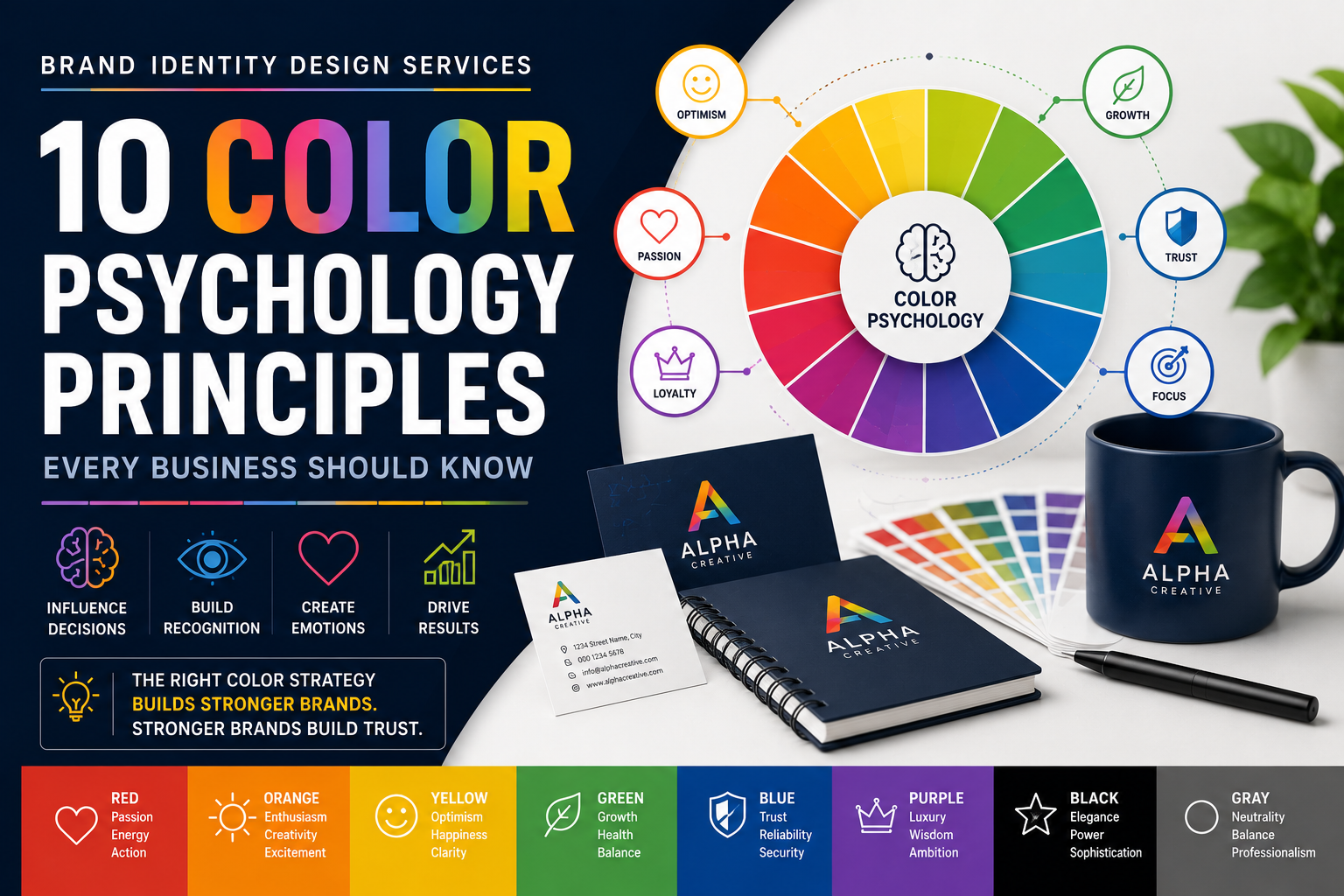
Principle #2: Every Colour Communicates Emotion
Colours influence emotions in subtle but powerful ways.
Although responses vary between individuals and cultures, certain associations appear frequently in branding.
Blue
Blue is one of the most widely used business colours because it often communicates:
- Trust
- Stability
- Professionalism
- Reliability
This explains why many banks, technology companies, healthcare providers, and consulting firms use blue prominently.
Red
Red attracts attention quickly.
It often represents:
- Passion
- Energy
- Urgency
- Excitement
Retail promotions, restaurants, and entertainment brands commonly use red to encourage action.
Green
Green frequently suggests:
- Growth
- Health
- Nature
- Sustainability
Environmental organisations, organic food companies, and wellness brands often choose green to reinforce their values.
Yellow
Yellow is associated with:
- Optimism
- Positivity
- Creativity
- Warmth
When used carefully, it helps brands appear energetic and approachable.
Too much yellow, however, can become visually overwhelming.
Black
Black often communicates:
- Luxury
- Elegance
- Sophistication
- Authority
Premium fashion brands, luxury hotels, and high-end service providers frequently incorporate black into their identity.
Professional Brand Identity Design Services rarely choose colours in isolation.
Instead, they combine colours strategically to create the emotional response that best supports the brand.
Principle #3: Consistency Strengthens Colour Recognition
Imagine if your favourite sports team changed its colours every month.
Or if a well-known coffee chain used different colours in every location.
Recognition would quickly disappear.
One of the biggest advantages of consistent colour usage is familiarity.
Customers begin recognising brands long before they read a logo or company name.
Think about some of the world’s most recognisable businesses.
Many people can identify them simply by seeing their signature colours.
This happens because repeated exposure strengthens memory.
Professional Brand Identity Design Services establish detailed colour guidelines covering:
- Primary brand colours
- Secondary colours
- Accent colours
- Digital colour values
- Print colour specifications
- Accessibility standards
- Usage examples
These guidelines ensure that every advertisement, website, social media graphic, brochure, and presentation reinforces the same visual identity.
Consistency creates recognition.
Recognition builds trust.
Trust influences customer decisions.
Why Colour Alone Isn’t Enough
Choosing attractive colours is only one part of effective branding.
Colours work best when they support other visual elements such as:
- Typography
- Photography
- Illustration style
- Brand messaging
- Logo design
- Website layout
A professional brand identity combines all these components into one cohesive system.
This is why businesses investing in Brand Identity Design Services often achieve stronger recognition than those focusing solely on individual design elements.
Rather than treating colour as decoration, successful brands use it as a communication tool.
Key Lessons from the First Three Principles
The first three principles reveal an important truth.
Colour is far more than a visual preference.
It shapes first impressions.
It influences emotions.
It strengthens recognition through consistency.
When combined with thoughtful strategy and professional execution, colour becomes one of the most valuable assets in a brand’s identity.
Businesses that understand these principles are better equipped to build memorable brands that customers recognise, trust, and remember.
Principle #4: Colour Must Match Your Brand Personality
Every successful brand has a personality.
Some businesses want to appear innovative and energetic.
Others want to communicate professionalism, elegance, or trust.
Your colour palette should reinforce that personality rather than contradict it.
Imagine a luxury jewellery brand using bright neon colours throughout its website. The colours might attract attention, but they wouldn’t communicate sophistication or exclusivity.
Likewise, a children’s learning centre built entirely around dark greys and muted tones may fail to create a welcoming atmosphere.
Customers expect a brand’s visual identity to align with its purpose.
For example:
Technology Companies
Often choose:
- Blue
- White
- Grey
These colours reinforce innovation, reliability, and simplicity.
Health and Wellness Brands
Frequently use:
- Green
- Blue
- Soft white
These colours communicate cleanliness, balance, health, and calmness.
Luxury Brands
Commonly rely on:
- Black
- White
- Gold
- Deep neutral tones
These colours help position products or services as premium and exclusive.
Creative Agencies
May incorporate:
- Orange
- Purple
- Vibrant gradients
- Bold accent colours
These choices suggest originality, creativity, and innovation.
Professional Brand Identity Design Services begin by defining a brand’s personality before selecting colours. Instead of asking, “Which colours look good?”, branding professionals ask, “What should customers feel when they see this brand?”
That shift in thinking produces stronger and more meaningful branding.
Principle #5: Cultural Meanings Matter
Colours don’t carry the same meaning everywhere.
A colour that creates positive associations in one region may communicate something entirely different in another.
For businesses serving international audiences, this becomes especially important.
For example:
- White is often associated with purity and simplicity in many Western countries.
- In some Asian cultures, white has traditionally been linked to mourning and remembrance.
- Red is commonly associated with energy, excitement, and urgency in many countries, while in others it symbolises prosperity, celebration, or good fortune.
- Green may represent sustainability and nature in one market but carry religious or cultural significance in another.
Businesses expanding globally should research the cultural meanings of colours before finalising their brand identity.
Professional Brand Identity Design Services consider:
- Geographic markets
- Cultural expectations
- Industry standards
- Local customer behaviour
This helps businesses create branding that feels familiar and respectful to diverse audiences.
Ignoring cultural context can unintentionally send the wrong message, even when the design itself is visually appealing.
Principle #6: Contrast Improves Readability and User Experience
Beautiful colours lose their value if customers struggle to read your content.
One of the most overlooked aspects of branding is colour contrast.
Good contrast helps users quickly distinguish between:
- Headlines
- Body text
- Buttons
- Backgrounds
- Navigation menus
- Calls to action
Poor contrast creates frustration.
For example:
- Light grey text on a white background
- Yellow text on a cream background
- Bright red text on dark green
- Small blue text on black
These combinations reduce readability and increase the likelihood that visitors leave your website.
Professional Brand Identity Design Services balance creativity with usability by selecting colours that are both attractive and functional.
Accessibility also plays an important role.
Many users have visual impairments or colour vision deficiencies. Sufficient colour contrast helps ensure your website and marketing materials remain usable for the widest possible audience.
A professional brand should never sacrifice clarity for decoration.
Principle #7: Less Is Often More
Many businesses assume that using more colours will make their branding more memorable.
In reality, the opposite is often true.
A brand using eight or ten unrelated colours can appear inconsistent and difficult to recognise.
Strong brands usually rely on a carefully planned colour system.
This often includes:
- One primary colour
- One or two secondary colours
- A limited number of accent colours
- Neutral shades for balance
This approach creates consistency while giving designers enough flexibility to develop marketing materials across different platforms.
For example:
A company might use:
- Navy blue as its primary colour
- Orange for calls to action
- White for clean backgrounds
- Light grey for supporting elements
Every advertisement, brochure, website page, and social media graphic then follows this colour system.
Customers begin recognising the brand immediately because the colours remain consistent.
Professional Brand Identity Design Services prioritise quality over quantity.
Instead of asking, “How many colours should we use?”, they ask, “Which colours best represent the brand?”
A focused palette is easier to remember, easier to apply, and more effective over the long term.
Common Colour Mistakes Businesses Should Avoid
Even businesses with attractive logos sometimes weaken their branding through poor colour decisions.
Here are some of the most common mistakes.
Choosing Colours Based on Personal Preference
A founder’s favourite colour may not reflect the brand’s personality or appeal to the target audience.
Brand decisions should be guided by strategy rather than individual taste.
Following Short-Term Design Trends
Colour trends change every year.
Building an identity around a temporary trend may cause the brand to appear outdated within a short time.
Timeless branding generally performs better than trend-driven branding.
Ignoring Accessibility
Low-contrast colour combinations make websites and marketing materials difficult to read.
Accessible branding improves the experience for every customer.
Using Too Many Colours
A cluttered palette weakens recognition.
Limiting colours creates stronger consistency across all customer touchpoints.
Inconsistent Colour Usage
Changing shades across advertisements, social media posts, and printed materials makes a brand harder to recognise.
Professional brand guidelines help eliminate these inconsistencies.
Why Colour Should Be Part of a Complete Brand Strategy
Colour is powerful, but it cannot work in isolation.
Successful branding combines colour with:
- Log
- o design
- Typography
- Photography
- Graphic elements
- Messaging
- Brand voice
- Website design
- User experience
Together, these elements create a complete identity that customers recognise and trust.
This holistic approach is what separates professional Brand Identity Design Services from simply choosing attractive colours.
Businesses that invest in a complete branding strategy are more likely to create memorable customer experiences and long-term brand recognition.
Principle #8: Colour Influences Buying Decisions
Although customers often believe they make purchasing decisions based purely on price, features, or quality, colour plays a surprisingly important role in influencing those decisions.
Colour affects how people:
- Notice products
- Interpret value
- Respond to promotions
- Trust businesses
- Remember brands
For example, imagine browsing an online store where every button blends into the background.
Now compare it with a website where important actions like “Get Started,” “Buy Now,” or “Contact Us” stand out clearly through carefully chosen accent colours.
The second experience feels easier because the design naturally guides your attention.
Professional Brand Identity Design Services don’t use colour randomly. They strategically assign colours to different purposes, such as:
- Primary action buttons
- Promotional banners
- Important announcements
- Product highlights
- Navigation menus
- Contact forms
This thoughtful use of colour improves user experience and helps customers make decisions with greater confidence.
It’s important to remember that colour doesn’t manipulate people into buying. Instead, it reduces confusion, improves clarity, and encourages engagement by making information easier to process.
Principle #9: Colour Supports Brand Positioning
Every business occupies a unique position in the market.
Some brands compete on affordability.
Others compete on luxury, innovation, sustainability, or reliability.
Colour plays a major role in communicating that position before customers read a single sentence.
Consider these examples:
Premium Brands
Luxury businesses often favour:
- Black
- Gold
- Deep navy
- Charcoal
- White
These colours suggest exclusivity, sophistication, and quality.
Budget-Friendly Brands
Businesses focused on affordability may choose:
- Bright blue
- Orange
- Green
- Red
These colours often create an energetic, accessible, and value-driven impression.
Eco-Friendly Brands
Companies promoting environmental responsibility commonly use:
- Green
- Brown
- Earth tones
- Soft neutrals
These palettes reinforce messages of sustainability and natural living.
Technology Brands
Modern technology companies frequently combine:
- Blue
- White
- Grey
These colours communicate innovation, simplicity, intelligence, and trust.
Professional Brand Identity Design Services align colour choices with a company’s positioning strategy rather than following design trends.
When colours accurately reflect the brand’s market position, customers develop clearer expectations about the business.
Principle #10: Colour Should Evolve Thoughtfully
Strong brands remain recognisable for years.
However, that doesn’t mean their colours never change.
Many successful businesses gradually refresh their branding to stay modern while preserving recognition.
A thoughtful colour evolution might involve:
- Brightening an existing palette
- Improving accessibility
- Simplifying gradients
- Modernising supporting colours
- Enhancing digital usability
Notice that these updates usually refine rather than replace the identity.
Customers continue recognising the brand because the core visual language remains familiar.
Completely changing colours without a clear reason can weaken years of brand recognition.
Professional Brand Identity Design Services help businesses decide when a colour refresh is appropriate and how to implement changes without confusing existing customers.
The goal isn’t change for its own sake.
The goal is to remain relevant while protecting brand equity.
How to Choose the Right Brand Colours for Your Business
Selecting colours involves much more than personal preference.
A strategic process leads to stronger branding and more consistent communication.
1. Define Your Brand Personality
Before choosing colours, identify how you want customers to describe your business.
For example:
- Trustworthy
- Innovative
- Friendly
- Professional
- Creative
- Premium
- Energetic
Your colour palette should reinforce these qualities.
2. Understand Your Target Audience
Different audiences respond differently to colours.
Consider factors such as:
- Age group
- Industry
- Geographic location
- Cultural background
- Customer expectations
Colours that appeal to children may not suit a law firm.
Colours appropriate for luxury fashion may not fit a healthcare provider.
3. Study Competitors Without Copying Them
Review how businesses in your industry use colour.
Ask yourself:
- Which colours appear most frequently?
- Why are they popular?
- How can your brand remain distinctive while meeting customer expectations?
Standing out doesn’t always mean choosing completely different colours.
Sometimes subtle differences create stronger recognition.
4. Keep the Colour Palette Focused
A well-structured palette often includes:
- One primary brand colour
- One or two secondary colours
- One accent colour
- Neutral supporting colours
This creates flexibility while maintaining consistency.
5. Test Colours Across Multiple Platforms
Colours may appear differently on:
- Websites
- Mobile devices
- Printed brochures
- Business cards
- Social media graphics
- Packaging
- Signage
Always evaluate your palette across real-world applications before finalising it.
6. Prioritise Accessibility
Ensure sufficient contrast between text and backgrounds.
Avoid relying solely on colour to communicate important information.
Accessible branding creates better experiences for everyone.
7. Develop Clear Brand Guidelines
Document:
- Colour values
- Usage rules
- Approved combinations
- Background options
- Accessibility requirements
- Print specifications
- Digital specifications
Comprehensive guidelines help maintain consistency as your business grows.
Real-World Example: Two Businesses, Two Different Outcomes
Imagine two new accounting firms entering the same market.
Firm A
The owner selects colours based purely on personal preference.
Over time:
- The website uses several shades of blue.
- Social media posts introduce different colours every month.
- Printed brochures don’t match digital assets.
- Employees create presentations using random templates.
Customers struggle to recognise the brand because its appearance constantly changes.
Firm B
The owner invests in professional Brand Identity Design Services.
The agency develops:
- A defined colour palette
- Typography standards
- Brand guidelines
- Marketing templates
- Website design rules
- Social media templates
Every customer interaction reinforces the same identity.
Within a short period, the business becomes easier to recognise, appears more professional, and builds stronger trust.
The difference isn’t simply better design.
It’s consistent strategy.
The Lasting Value of Colour Psychology
Colours may seem like small design decisions, but together they shape customer expectations, emotions, and memories.
Businesses that treat colour as a strategic communication tool rather than decoration create stronger first impressions and more consistent brand experiences.
Professional Brand Identity Design Services combine psychology, strategy, and creativity to ensure every colour choice supports the business rather than competing with it.
As customer expectations continue evolving, brands that understand the psychology behind colour will remain more memorable, trustworthy, and competitive.
Frequently Asked Questions (FAQs)
1. What is colour psychology in branding?
Colour psychology is the study of how colours influence human emotions, perceptions, and behaviour. In branding, it helps businesses choose colours that communicate their personality, values, and message effectively. A well-planned colour palette can improve brand recognition, build trust, and create stronger emotional connections with customers.
2. Why is colour important in Brand Identity Design Services?
Colour is often the first thing people notice about a brand. Professional Brand Identity Design Services use colour strategically to create a consistent visual identity that reflects a company’s personality and appeals to its target audience. The right colours make a brand more memorable and help differentiate it from competitors.
3. Can the wrong colours affect a business?
Yes. Colours that don’t align with a brand’s personality or audience can create confusion, weaken credibility, and reduce customer engagement. For example, using playful, vibrant colours for a legal consultancy may make the business appear less professional, while overly dark colours may not suit a children’s brand.
4. How many colours should a brand use?
Most successful brands use a focused colour system consisting of:
- One primary colour
- One or two secondary colours
- One accent colour
- Neutral supporting colours
Keeping the palette simple improves consistency and makes the brand easier to recognise.
5. Should small businesses invest in professional branding?
Absolutely. A consistent and professional brand identity helps businesses appear more trustworthy, even when competing with larger companies. Investing in Brand Identity Design Services early can strengthen customer confidence and create a solid foundation for long-term growth.
6. Do colours have the same meaning in every country?
No. Colour meanings often vary across cultures. While blue may symbolise trust in many regions, other colours can have different cultural or religious associations depending on the country. Businesses serving international audiences should consider these differences when building their brand identity.
7. How often should a business update its brand colours?
A complete colour change should be approached carefully. If your existing colours still reflect your brand and resonate with your audience, only minor refinements may be needed. Most successful companies evolve their colour palettes gradually rather than making dramatic changes that could affect brand recognition.
8. How can businesses choose the right colour palette?
Start by understanding your brand’s personality, target audience, industry, and long-term goals. Then develop a limited, consistent palette that works across websites, social media, print materials, and other marketing channels. Working with experienced Brand Identity Design Services ensures every colour choice supports your overall branding strategy.
Conclusion
Colour is much more than a design choice—it is a powerful communication tool that influences how customers perceive your business from the very first interaction. Whether someone visits your website, scrolls through your social media, or notices your logo on a business card, your colour palette silently communicates messages about your professionalism, values, and personality.
Throughout this guide, we’ve explored ten key principles of colour psychology, from shaping first impressions and communicating emotion to supporting brand positioning and improving customer experience. Together, these principles demonstrate that effective branding isn’t about choosing colours you personally like; it’s about selecting colours that represent your business, connect with your audience, and remain consistent across every touchpoint.
Businesses that treat colour as part of a broader branding strategy are more likely to build lasting recognition and customer trust. Consistency, accessibility, cultural awareness, and thoughtful planning all contribute to a visual identity that stands the test of time. Rather than following temporary design trends, successful brands focus on creating a timeless identity that evolves carefully while maintaining familiarity.
Professional Brand Identity Design Services bring together market research, psychology, creative design, and strategic thinking to develop identities that do more than look attractive. They create visual systems that help businesses communicate clearly, differentiate themselves in competitive markets, and leave a memorable impression on potential customers.
Whether you’re launching a new business, refreshing an existing brand, or planning future growth, investing time in understanding colour psychology is a smart decision. The colours you choose today will influence how customers remember your business tomorrow. By applying these principles thoughtfully, you can build a brand that not only captures attention but also earns trust, strengthens recognition, and supports sustainable business success.
Strengthen Your Brand Identity with Gowenza
Creating an effective brand involves much more than selecting attractive colours. At Gowenza, we help businesses build complete, strategy-driven brand identities that reflect their vision and connect with their target audience.
Our services include:
- Brand Identity Design Services for logos, colour palettes, typography, and brand guidelines
- Professional Website Development Services for responsive, user-friendly websites
- Result-driven SEO Services to improve search engine visibility
- Creative Graphic Design Services for marketing materials and social media
- Performance-focused Digital Marketing Services to grow your online presence
- ROI-oriented Google Ads Services to generate quality leads and conversions
Whether you’re a startup building your first brand or an established company looking to refresh your identity, Gowenza combines creativity with strategy to help your business stand out.
Gowenza — Create. Innovate. Elevate.
- Google Search Central – Learn best practices for building user-friendly websites and creating content that supports long-term SEO success.
https://developers.google.com/search - Adobe Creative Cloud – Explore colour theory, brand design principles, and professional creative resources used by designers worldwide.
https://www.adobe.com/creativecloud.html - Nielsen Norman Group (NN/g) – Read research-backed articles on user experience, visual design, accessibility, and customer behaviour.
https://www.nngroup.com