Why Mobile-First Website Development Matters in 2026: A Website Development Company Guide
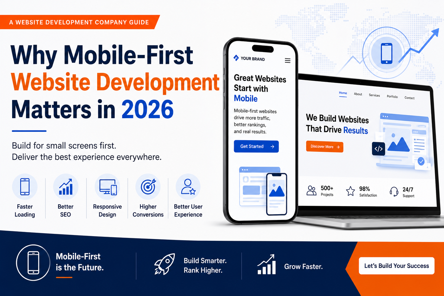
Why Mobile-First Website Development Matters in 2026: A Website Development Company Guide
Table of Contents
Introduction
What Is Mobile-First Website Development?
Why Mobile Usage Continues to Dominate in 2026
Understanding Google’s Mobile-First Indexing
Key Benefits of Mobile-First Website Development
Mobile-First Design Principles Every Business Should Follow
Common Mobile Website Mistakes That Hurt Performance
How Mobile-First Development Improves SEO
Why Every Website Development Company Prioritizes Mobile-First Design
Industries That Benefit the Most
The Future of Mobile-First Website Development
Conclusion
Frequently Asked Questions
Introduction
The way people browse the internet has changed dramatically over the last decade. Smartphones have become the primary device for searching, shopping, comparing products, booking services, reading reviews, and interacting with businesses online. Whether someone is looking for a nearby restaurant, requesting a service quote, or purchasing products from an online store, the journey often begins on a mobile device.
For businesses, this shift has completely changed how websites should be designed and developed. A website that performs well on a desktop computer but offers a poor mobile experience can lose potential customers within seconds. Visitors expect websites to load quickly, display correctly on every screen size, and allow them to complete tasks without frustration. If these expectations are not met, they simply move to a competitor.
Search engines have adapted to these changing user habits as well. Google now evaluates the mobile version of your website as the primary version when determining search rankings. This means mobile usability directly affects your visibility, organic traffic, and overall online performance.
As a result, mobile-first development has become the standard for modern websites rather than an optional feature. Instead of creating a desktop website and shrinking it to fit smaller screens, developers now begin with the mobile experience and progressively enhance it for tablets, laptops, and desktop devices. This approach ensures every visitor receives a fast, intuitive, and consistent browsing experience regardless of the device they use.
A professional Website Development Company understands that mobile-first development is about much more than responsive layouts. It involves improving page speed, simplifying navigation, enhancing accessibility, optimizing touch interactions, and building websites that meet both user expectations and search engine requirements.
In this guide, you’ll learn why mobile-first website development matters more than ever in 2026, how it influences SEO and user experience, and why working with an experienced Website Development Company can help your business stay competitive in an increasingly mobile-driven digital landscape.
What Is Mobile-First Website Development?
Mobile-first website development is a design and development strategy where the website is planned, designed, and built for mobile devices before adapting it for larger screens.
In the past, websites were primarily created for desktop computers. Developers would later adjust those desktop layouts to fit smartphones and tablets. This often resulted in cluttered pages, slow loading times, and poor usability on smaller screens.
The mobile-first approach reverses this process.
Developers begin by focusing on the smallest screen, ensuring users can easily read content, navigate menus, tap buttons, and complete actions such as filling out forms or making purchases. Once the mobile experience is fully optimized, additional enhancements are added for larger devices.
A professional Website Development Company follows this approach because it encourages simplicity, efficiency, and usability from the beginning of the project.
Key characteristics of mobile-first development include:
Responsive layouts that adapt to every screen size
Simple navigation with clear menus
Fast-loading pages
Optimized images
Readable typography
Large touch-friendly buttons
Accessible forms
Streamlined content structure
By prioritizing the mobile experience, businesses create websites that work effectively for all users rather than treating mobile visitors as an afterthought.
Why Mobile Usage Continues to Dominate in 2026
Consumer behavior continues to shift toward mobile browsing.
People now rely on smartphones throughout the day to search for information, compare products, watch videos, read reviews, and communicate with businesses. Mobile devices provide instant access to information regardless of location, making them the preferred choice for millions of users.
Several factors explain why mobile usage continues to grow.
Convenience
Smartphones allow users to browse the internet anywhere and anytime. Whether someone is commuting, waiting for an appointment, or relaxing at home, they can quickly access business websites with just a few taps.
Faster Internet Connections
The expansion of 5G networks and improved broadband infrastructure has significantly enhanced mobile browsing speeds. Users now expect websites to load almost instantly, making performance optimization more important than ever.
Growth of Mobile Commerce
Consumers increasingly purchase products directly from their smartphones. From fashion and electronics to food delivery and travel bookings, mobile commerce continues to expand across nearly every industry.
Businesses that fail to provide a smooth mobile shopping experience risk losing customers during the purchasing process.
Voice Search and Local Search
Many mobile users rely on voice assistants to find nearby businesses, services, and products. Local searches such as “website development company near me,” “best digital marketing agency,” or “restaurants open now” often lead to immediate purchasing decisions.
Optimizing websites for mobile users also supports better visibility in local search results.
Changing Customer Expectations
Today’s users expect websites to function perfectly on every device. They have little patience for slow-loading pages, broken layouts, or difficult navigation.
A professional Website Development Company recognizes these changing expectations and designs websites that deliver fast, intuitive experiences regardless of screen size.
Understanding Google’s Mobile-First Indexing
Google’s goal is to provide users with the best possible search experience.
Since most searches now originate from mobile devices, Google primarily evaluates the mobile version of a website when determining rankings. This approach is known as mobile-first indexing.
In simple terms, Google examines how your website performs on smartphones before deciding where it should appear in search results.
If your mobile website has missing content, slow loading times, poor navigation, or technical issues, your search rankings may suffer—even if the desktop version performs well.
A professional Website Development Company ensures every website meets Google’s mobile-first expectations by implementing:
Responsive design
Fast page loading
Mobile-friendly navigation
Optimized images
Proper heading hierarchy
Crawlable website structure
Accessible forms
Clean HTML and CSS
Core Web Vitals optimization
Rather than creating separate desktop and mobile websites, modern development focuses on delivering one responsive website that performs consistently across all devices.
This approach simplifies maintenance while improving SEO, usability, and long-term performance.
Key Benefits of Mobile-First Website Development
Adopting a mobile-first strategy provides measurable benefits for both businesses and website visitors.
Improved User Experience
A mobile-first website makes it easier for visitors to navigate pages, read content, complete forms, and contact your business.
When users enjoy a smooth browsing experience, they are more likely to remain on your website, explore additional pages, and become customers.
Better Search Engine Visibility
Because Google uses mobile-first indexing, mobile-friendly websites have a stronger technical foundation for SEO.
Faster loading speeds, responsive layouts, and improved usability contribute to higher search rankings over time.
Higher Conversion Rates
Simple navigation, faster checkout processes, and clear call-to-action buttons reduce friction throughout the customer journey.
This often results in more enquiries, bookings, purchases, and lead submissions.
Faster Website Performance
Mobile-first websites prioritize efficiency by reducing unnecessary elements and optimizing resources.
A skilled Website Development Company focuses on minimizing page weight, compressing images, reducing unnecessary scripts, and improving server response times to deliver faster loading speeds.
Future-Ready Development
Technology continues to evolve rapidly, but the demand for mobile accessibility is only expected to increase.
Building your website with a mobile-first mindset prepares your business for future devices, changing user behaviors, and evolving search engine standards, reducing the need for costly redesigns later.
Mobile-First Design Principles Every Business Should Follow
Building a mobile-first website requires more than making pages fit smaller screens. It involves designing every element around the way people naturally interact with smartphones. Visitors use their thumbs instead of a mouse, browse while on the move, and expect instant access to information. A website that ignores these behaviors can quickly lose potential customers.
A professional Website Development Company follows proven mobile-first design principles to ensure every visitor enjoys a smooth and frustration-free experience.
Keep Navigation Simple
Complex menus work on large desktop screens but become difficult to use on smartphones. Mobile visitors should be able to find important information in just a few taps.
Best practices include:
Clear navigation menus
Logical page hierarchy
Easy-to-find contact information
Sticky navigation bars
Simple menu labels
When users don’t have to search for information, they stay engaged longer and are more likely to take action.
Design for Touch Instead of Clicks
Desktop users interact with a mouse, while mobile users rely on their fingers. Buttons that are too small or placed too closely together often lead to accidental taps.
A mobile-first website should include:
Large buttons
Adequate spacing between clickable elements
Easy-to-use forms
Touch-friendly navigation
Clickable phone numbers and email addresses
These small improvements create a smoother browsing experience and reduce user frustration.
Prioritize Readability
Content should be easy to read without zooming.
A mobile-first layout uses:
Readable font sizes
Short paragraphs
Clear headings
Bullet points
Plenty of white space
Visitors often scan content rather than reading every word. Breaking information into smaller sections improves readability and keeps users engaged.
Focus on Essential Content
Smartphone screens have limited space.
Instead of overwhelming visitors with excessive information, prioritize content that directly supports user intent.
Ask yourself:
What information does the visitor need first?
Which action should they take next?
What questions should this page answer?
Removing unnecessary elements creates a cleaner experience and improves website performance.
Optimize Every Image
Images make websites visually appealing, but they can also slow loading speeds if not optimized correctly.
A professional Website Development Company ensures images are:
Compressed without noticeable quality loss
Responsive across different screen sizes
Properly formatted
Lazy-loaded where appropriate
Optimized images improve both user experience and search engine performance.
Common Mobile Website Mistakes That Hurt Performance
Many businesses believe their website is mobile-friendly simply because it can be viewed on a smartphone. Unfortunately, there’s a significant difference between being viewable and being optimized.
Below are some of the most common mistakes that reduce performance, increase bounce rates, and frustrate visitors.
Slow Loading Pages
Mobile users expect websites to load within seconds.
Large images, excessive JavaScript, poor hosting, and unnecessary animations often create delays that drive visitors away.
Even a few extra seconds can significantly reduce conversions.
Poor Navigation
Menus that require multiple taps or contain too many options make browsing difficult.
Visitors should always know:
Where they are
Where they can go next
How to contact your business
Simple navigation improves both usability and engagement.
Intrusive Pop-Ups
Large pop-ups that cover the entire mobile screen often frustrate users.
Instead of helping conversions, they frequently increase bounce rates.
If pop-ups are necessary, they should be:
Easy to close
Mobile-friendly
Non-intrusive
Relevant to user intent
Tiny Text and Buttons
Visitors should never need to zoom in to read content or tap buttons.
Proper spacing and readable typography are essential components of a successful mobile-first website.
Unoptimized Forms
Long forms discourage mobile users.
Whenever possible, reduce the number of required fields.
For example, instead of requesting excessive information immediately, collect only essential details during the first interaction.
Shorter forms generally improve completion rates.
Ignoring Accessibility
Accessible websites serve everyone more effectively.
Accessibility considerations include:
Color contrast
Keyboard navigation
Screen reader compatibility
Alternative text for images
Clear form labels
Accessibility also contributes to a better overall user experience.
How Mobile-First Development Improves SEO
Search engine optimization involves much more than keywords and content.
Technical performance plays an equally important role.
A mobile-first website creates a stronger SEO foundation by improving the factors Google values most.
Better Mobile Indexing
Google primarily evaluates mobile websites when determining rankings.
A properly optimized mobile website helps search engines understand your content more effectively.
Faster Page Speed
Website speed remains one of the most important ranking factors.
Mobile-first development focuses on reducing unnecessary resources, optimizing code, and improving loading performance.
Fast websites improve:
User satisfaction
Search rankings
Conversion rates
Bounce rates
Improved User Engagement
Search engines monitor how users interact with websites.
When visitors remain on your website longer, explore additional pages, and complete meaningful actions, it sends positive quality signals.
A professional Website Development Company improves engagement by creating intuitive navigation, faster performance, and better page layouts.
Stronger Local SEO
Many local searches originate from smartphones.
Examples include:
Website development company near me
Best digital marketing agency
Nearby restaurants
Local service providers
Mobile-friendly websites often perform better in local search because they provide a better experience for users searching while on the move.
Better Core Web Vitals
Core Web Vitals measure real-world user experience.
They evaluate:
Loading performance
Visual stability
Page responsiveness
Optimizing these metrics improves both search visibility and customer satisfaction.
Why Every Website Development Company Prioritizes Mobile-First Design
Experienced developers understand that mobile-first development isn’t simply another design trend.
It has become the industry standard.
Every reputable Website Development Company prioritizes mobile-first design because it produces websites that are:
Easier to use
Faster to load
Better optimized for SEO
More accessible
More scalable
Better prepared for future technologies
Businesses increasingly rely on their websites to generate leads, process online sales, and support customer service.
A poor mobile experience directly affects revenue.
Professional developers therefore begin every project by asking important questions such as:
What will mobile visitors need first?
Which actions should be easiest to complete?
How can unnecessary steps be eliminated?
Which pages require the highest level of optimization?
This user-focused approach results in websites that perform well across all devices rather than treating smartphones as an afterthought.
Another reason every Website Development Company embraces mobile-first development is future scalability.
New devices continue entering the market with different screen sizes and resolutions. Responsive, mobile-first architecture adapts far more easily to changing technologies than older desktop-first designs.
Finally, mobile-first development supports better collaboration between designers, developers, SEO specialists, and content creators. Since everyone works toward the same goal—creating the best possible experience for mobile users—the final website becomes more consistent, efficient, and effective.
For businesses investing in a new website, choosing a Website Development Company that follows a mobile-first approach isn’t simply a design preference. It’s a strategic decision that improves user experience, strengthens SEO, increases conversions, and prepares the business for long-term digital growth.
Industries That Benefit the Most from Mobile-First Website Development
Almost every industry benefits from a mobile-first website, but for some businesses, it can have a direct impact on customer acquisition, online sales, and revenue. Since most consumers now research products and services using smartphones, businesses that provide a smooth mobile experience gain a significant competitive advantage.
A professional Website Development Company understands that every industry has different customer expectations and builds mobile-first websites accordingly.
Local Businesses
Local businesses depend heavily on mobile users searching for nearby products and services.
People often search while they are:
Traveling
Shopping
Looking for emergency services
Comparing businesses
Reading reviews
A mobile-first website makes it easy for potential customers to:
Find your contact details
View your location
Call your business with one tap
Request a quote
Read customer reviews
When users can complete these actions quickly, they are more likely to choose your business over competitors.
eCommerce Stores
Mobile shopping continues to grow every year.
Customers expect to browse products, compare prices, add items to their cart, and complete secure payments without switching to a desktop computer.
A professional Website Development Company creates mobile-first eCommerce websites with features such as:
Fast product pages
Mobile-friendly navigation
Secure checkout
Simple product filters
Optimized product images
Multiple payment options
Reducing friction throughout the purchasing process helps increase sales and reduce abandoned carts.
Healthcare Providers
Hospitals, clinics, dentists, and diagnostic centers receive a large percentage of their website traffic from mobile devices.
Patients frequently use smartphones to:
Book appointments
Find doctors
Check clinic timings
Read healthcare information
Contact emergency services
A mobile-first website ensures this information is always accessible and easy to navigate.
Professional Service Businesses
Law firms, accounting firms, consultants, architects, and marketing agencies rely on trust to convert visitors into clients.
A professional mobile-first website helps showcase:
Services
Case studies
Testimonials
Certifications
Contact forms
Consultation booking
A well-structured mobile experience encourages visitors to reach out without unnecessary obstacles.
Educational Institutions
Schools, colleges, training centers, and online learning platforms increasingly serve students who access information through smartphones.
Mobile-first websites make it easier to:
Browse courses
Register online
Download brochures
Contact admissions teams
Access learning materials
Improving accessibility benefits both students and educational institutions.
The Future of Mobile-First Website Development
Technology continues to evolve, but one trend remains consistent—mobile devices will continue to play a central role in how people access the internet.
Businesses that invest in mobile-first development today will be better prepared for tomorrow’s digital landscape.
Several emerging technologies are expected to influence website development over the coming years.
AI-Powered Personalization
Artificial Intelligence is making websites smarter by adapting content based on visitor behavior.
Future mobile websites may automatically display:
Personalized recommendations
Relevant offers
Dynamic content
Customized landing pages
This creates more engaging experiences while improving conversion rates.
Voice Search Optimization
Voice assistants continue to influence how users search online.
Instead of typing short keywords, users increasingly ask conversational questions.
A professional Website Development Company prepares websites for voice search by improving page structure, implementing structured data, and creating content that answers real user questions clearly.
Progressive Web Applications (PWAs)
Progressive Web Applications combine the advantages of websites and mobile applications.
Benefits include:
Offline functionality
Faster loading
Push notifications
App-like user experience
Improved engagement
Many businesses are expected to adopt PWAs as customer expectations continue to evolve.
Better Accessibility Standards
Inclusive design is becoming increasingly important.
Future mobile websites will continue improving accessibility for users with visual, hearing, motor, and cognitive impairments.
Accessibility benefits every visitor while supporting compliance with modern web standards.
Faster Web Technologies
New development frameworks, improved hosting infrastructure, and enhanced browser capabilities will continue improving mobile performance.
Businesses that regularly update their websites will be better positioned to take advantage of these technological improvements.
Conclusion
Mobile-first website development is no longer an optional strategy—it has become the foundation of successful web development in 2026. As mobile internet usage continues to grow, businesses must deliver websites that are fast, responsive, accessible, and easy to use on every screen size.
A mobile-first approach improves much more than appearance. It strengthens user experience, supports search engine optimization, increases conversion rates, reduces bounce rates, and prepares businesses for future technological advancements. Whether a visitor is browsing products, requesting a quote, booking an appointment, or reading your latest blog, every interaction should feel effortless on a smartphone.
Working with a professional Website Development Company ensures your website is designed with mobile users in mind from the very beginning. Instead of adapting a desktop website for smaller screens, experienced developers create responsive, performance-focused websites that meet Google’s mobile-first indexing requirements while delivering exceptional experiences for your customers.
If your current website is slow, difficult to navigate on mobile devices, or failing to generate the results your business needs, now is the right time to consider a mobile-first redesign. Investing in modern website development today helps protect your business from falling behind tomorrow.
A well-designed mobile-first website is more than a digital presence—it is a powerful business asset that attracts visitors, builds trust, improves search visibility, and supports sustainable growth.
Frequently Asked Questions
1. What is mobile-first website development?
Mobile-first website development is an approach where a website is designed and developed for smartphones before being optimized for larger screens such as tablets and desktops. This ensures the best possible experience for mobile users.
2. Why is mobile-first development important for SEO?
Google primarily uses the mobile version of a website for indexing and ranking. A mobile-friendly website with fast loading speeds, responsive design, and excellent usability has a stronger foundation for search engine optimization.
3. Is responsive design the same as mobile-first design?
Not exactly. Responsive design allows a website to adapt to different screen sizes, while mobile-first design begins with the mobile experience and then expands to larger devices. Mobile-first is considered a more user-focused development strategy.
4. Which businesses benefit most from mobile-first development?
Almost every business benefits, including local businesses, eCommerce stores, healthcare providers, educational institutions, professional service firms, restaurants, and real estate companies.
5. How can a Website Development Company help with mobile-first development?
A professional Website Development Company designs responsive layouts, optimizes page speed, improves Core Web Vitals, enhances technical SEO, creates touch-friendly navigation, and ensures your website performs consistently across all devices.
6. How often should a mobile website be updated?
Businesses should review and update their websites regularly. Security updates should be applied as soon as they are available, while design, performance, and content should be evaluated at least once a year to keep the website modern, secure, and competitive.
If you’re planning to build a new website or upgrade your existing one, partnering with an experienced Website Development Company can make all the difference. At Gowenza, we specialize in creating fast, mobile-first, SEO-friendly, and conversion-focused websites tailored to your business goals. Whether you need a corporate website, an eCommerce store, or a complete website redesign, our expert team delivers responsive web solutions that help businesses improve user experience, increase search visibility, and generate more qualified leads. Explore our Website Development Services to discover how we can help your business build a future-ready online presence.
To learn more about mobile-first website development, website performance, and SEO best practices, explore these trusted resources:
- Google Search Central – https://developers.google.com/search
Official guidance from Google on SEO, indexing, mobile-first best practices, and website optimization. - Google PageSpeed Insights – https://pagespeed.web.dev/
Analyze your website’s speed and receive recommendations to improve Core Web Vitals and overall performance. - web.dev – https://web.dev/
Learn about responsive design, mobile optimization, accessibility, and modern web development techniques. - MDN Web Docs – https://developer.mozilla.org/
Comprehensive documentation for HTML, CSS, JavaScript, responsive design, and web accessibility. - Google Lighthouse – https://developer.chrome.com/docs/lighthouse/
Audit your website for performance, accessibility, SEO, and best practices using Google’s free auditing tool. - Google Analytics Help Center – https://support.google.com/analytics
Learn how to measure website traffic, user behavior, conversions, and marketing performance.